Theory and Process – Projection Mapping
As part of our creative coding course we had a projection mapping assignment in which we created real-time graphics to be shown over real-world geometry. I went into quite a bit of technical and theoretical research as part of my project and that’s what this post is about.
Recursion / Slitscan / Folds – Three explorations in realtime image making. Each explores an aspect of art coding practice learned through the term and blended into an evolving, hypnotic sequence.
Introduction
Three explorations in realtime image making. Each explores an aspect of art coding practice learned through the term and blended into an evolving, hypnotic sequence. The first sequence employs a form of recursive pattern making, drawing shapes and points into infinity. The second sequence takes typography and stretches it into fluid patterns through a slitscan, and the final sequence transforms close up macro video into folded light patterns, slowly revealing the underlying images.
Concept and background research
Projection Mapping is an interesting medium to work within, as it affords a lot of creative options and techniques that don’t usually suit other video or animation formats. I love experimental film making and visual effects, as well as 90s typography and motion graphics, and thought this would be a great opportunity to revisit some of my favourite influences from design and film and reinterpret them in this context.

For the recursive sequence I was inspired by the Powers of 10 films by the Eames brothers. This film is a magnificent example of how scale can change perspective and evoke a sense of universality and spirituality. In my initial experiments I was playing with recursive tree elements, and eventually changed this to reflect a simple geometric pattern, to keep it in tune with the cubed projection surface. The motion is inspired by the 00’s motion graphics work of Gmunk and MK12, slick and “tweened” through a tweaked sin equation.

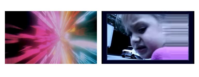
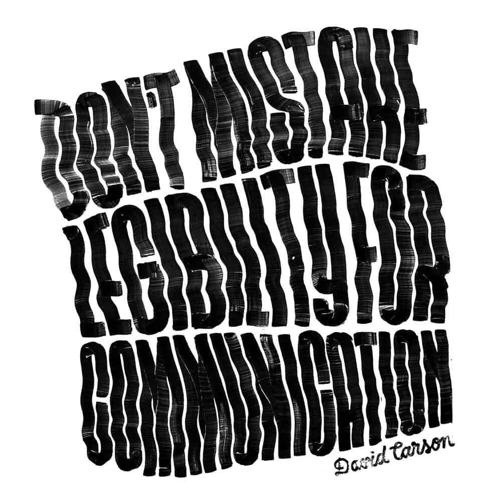
I knew I wanted to explore the slitscan effect as I found it incredibly satisfying to code that in our earlier lab exercises. The seminal slit-scan is the sequence from Kubrik’s 2001, and I employed this as a foundational reference. Exploring the technique further I started to combine it with deconstructed typography, with designers David Carson and Kyle Cooper key inspirations. I like the juxtaposition of hard vector typographic shapes melted and distorted into languid patterns, and the sequence works as an aesthetic counterpoint to the rigid geometry of the preceding sequence.

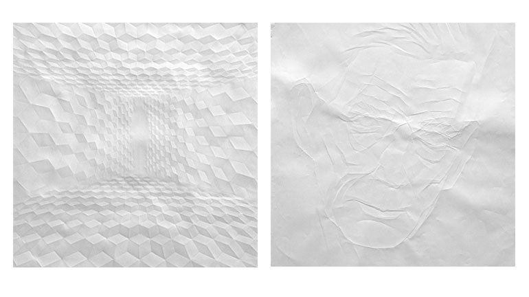
The folding paper effects were initially intended to be the most standard “projection mapping” style graphics, utilising bold slow geometric transitions to imply the cubes were rotating or unfolding in place. I looked into paper folding, origami, and artworks made our of folded surfaces. After finding a method for building multiple folds, and subdividing surfaces into many faces, I then merged the folds with video clips to imbue them with a frantic energy. As the sequence plays out the faces subdivide repeatedly, until the folds are small enough to act as pixels, making the video readable. The film is close ups of eyes and mouths, the idea being that our pyramid tower gains an awareness and starts to observe the room, before the final transition out.
Technical
It was a challenge coming into this process with a motion graphics background, as many of the techniques I’ve used in the past were simply too challening to replicate with my limited programming experience. I had big plans to have a lot of timed effects, but developing scenes that could really change over time turned out to be a huge challenge.
I spent an inordinate amount of time on the folding surface sequence. At the end of the process I realised that I’d spent too long creating a nice flexible sytem for folding a surface and not enough time thinking about how I should structure my code to make it easy to script events, so it could change over time. As a result the slitscan and recursion sequences were a lot faster to develop.
Another technical aspect that almost tripped me up was realising the difference processor power would play in the look of the final work. Particularly during the slitscan technique, I noticed that when I moved the project to an older computer only half of the scripted animation played in the time allotted to it. I had coded timers based on frames rather than millis and on the slower computer if never got to show all the frames. Refactoring ensued.
Future development
With further development, I would like to build in more flexibility to transition between scenes without resorting to the geometric wipes. The recursive patterns could naturally lead in to a slitscan style set of parallel lines. The slitscan might eventually melt into a full colour which could then start unfolding, and the unfolding sequence could do with being more structured and choreographed. Having said that, I will be pretty happy to not have to use ofxPimapper again for awhile.

Self evaluation
I’d agree with da Vinci’s quote “art is never finished, only abandoned.” I feel simultaneously happy and yet unsatisfied with my results on this project. My primary takeaway is that I let technical concerns overtake the big picture concept, and let my skills as a programmer end up dictating the creative rather than the other way around. My initial concept was to make each sequence related to phobias, like a deconstructed horror film, however as soon as I started researching classes (to program spiders) and looking at the time available I changed my ideas. I’m content with this as as a learning exercise. I have definitely challenged myself in terms of coding and think each of the sequences is strong as a piece of design, however I do wish there was a stronger overarching conceptual thread running through it.
In my defence I would say that projection mapping is an inherently tricky medium to work any complex message into. A central affordance it offers is the pure joy of seeing geometric effects play out over a surface, and it’s easy to overcook the message rather than respect what the form is really great at, which is creating a spectacle.
References
GMunk – FINN, 2002: https://www.youtube.com/watch?v=9eCrDAQa0fg
David Carson – Raygun Magazine – http://www.davidcarsondesign.com/t/tag/raygun/
Kyle Cooper – Se7en Titles, 1995: https://www.youtube.com/watch?v=-k2gsEI34CE
Stanley Kubrick – 2001: A Space Odyssey, 1968 – Slit Scan Effect https://www.youtube.com/watch?v=NaK4z3Fjpkk
Powers of Ten – Charles & Ray Eames, 1977 – https://www.youtube.com/watch?v=0fKBhvDjuy0
Simon Schubert – http://www.simonschubert.net/
